
Diagnostics & Process Pools
Monitor Bifrost worker containers, fork pools, queue depth, and memory usage from the Diagnostics dashboard.
The Diagnostics dashboard is the operator-facing view into Bifrost’s worker containers, fork-based process pools, scheduler replicas, platform-job capacity, queue depth, and live memory usage. It’s the first place to look when executions or scheduled platform tasks are slow, queueing up, or crashing.
Audience
Section titled “Audience”This guide is for self-hosted operators and on-call engineers who need to:
- Confirm worker containers are connected and healthy
- Spot a hot fork that’s chewing memory before it OOM-kills
- Triage backlog when the queue depth alert fires
- Trace which worker ran a specific execution
If you’re a workflow author looking at a single failed run, use the Execution History page instead.
Open the dashboard
Section titled “Open the dashboard”Open Diagnostics from the sidebar, or go directly to /diagnostics.
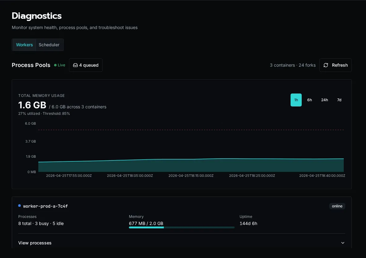
The page has two tabs: Workers and Scheduler. The Workers header shows a Live indicator when the WebSocket worker stream is connected — if it says “Connecting…” instead, REST snapshots will still populate the page but you won’t get sub-second updates.
What it shows
Section titled “What it shows”Summary header
Section titled “Summary header”The right-hand summary reports N container(s) · M fork(s):
- Container — one Bifrost worker pod / container. Each container registers itself on startup over Redis.
- Fork — one OS-level worker process inside a container. Workflows run in forks; each fork executes one task at a time.
If you’re sized for 4 containers × 8 forks, you should see 4 containers · 32 forks. Anything lower means a pod has died or hasn’t registered yet — check the pod’s logs.
Queue badge
Section titled “Queue badge”The badge next to the Live indicator shows the current depth of the execution queue (RabbitMQ). A small backlog (single digits) is normal during bursts. Sustained double-digit backlogs mean you don’t have enough fork capacity for the incoming rate — scale workers, raise pool size, or look for a slow workflow.
Memory chart
Section titled “Memory chart”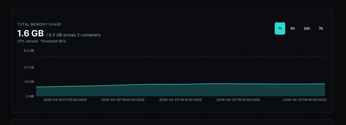
A live time-series of total RSS per container, color-coded per worker. The chart retains the last few minutes of data and updates as WebSocket heartbeats arrive.
Numbers worth alerting on:
- Sustained climb on a single container while others are flat — usually a workflow leaking memory in a fork. Expand that container’s card to see which fork is holding the bag.
- All containers near their pod memory limit — you’re undersized for the workload. Add containers or reduce
WORKER_POOL_SIZE. - Sawtooth pattern — forks are being recycled (good — process-pool memory pressure is being reclaimed). Steep teeth mean a single workflow is grabbing a lot of RSS per run; consider chunking it or tightening its data handling.
Container cards
Section titled “Container cards”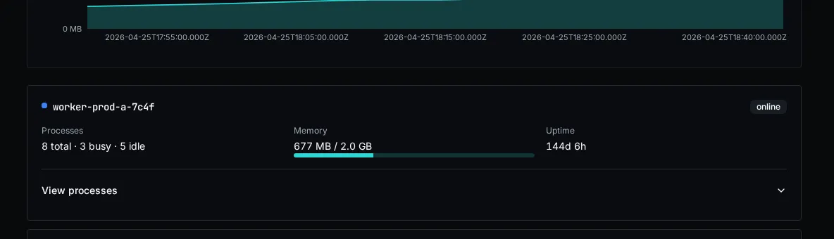
Each container has a card with its process count, aggregate memory, uptime, and health. Select View processes to inspect its forks. Per fork you see:
| Column | Meaning |
|---|---|
| PID | OS process ID inside the container. |
| State | idle, busy, terminating, or killed. A fork stuck in busy for a long time is the most common smell. |
| Memory (RSS) | Resident set size in MB. Compare to the container’s pod memory limit. |
| Current execution | Execution ID being processed, if any. Click through to the execution detail page. |
| Uptime | How long this fork has been alive since the last spawn/recycle. |
A fork that’s been busy for longer than your WORKFLOW_TIMEOUT is wedged — either the workflow is in a tight loop or asyncio is blocked on a sync call. Kill the pod and inspect the worker logs.
Refreshing the data
Section titled “Refreshing the data”Two paths:
- REST snapshot — the page mounts with a one-shot
/api/platform/workerscall so the cards are populated immediately even if the WebSocket hasn’t connected yet. - WebSocket heartbeats — each container streams its state every few seconds; the cards merge in updates by
worker_id. The Live dot pulses green while connected.
Click the Refresh button in the top-right to force a REST snapshot if you suspect the live stream is stale.
Scheduler diagnostics
Section titled “Scheduler diagnostics”Open the Scheduler tab to see the elected leader, online replicas, active platform-job claims, queued work, tasks waiting for memory, and the highest replica memory utilization.
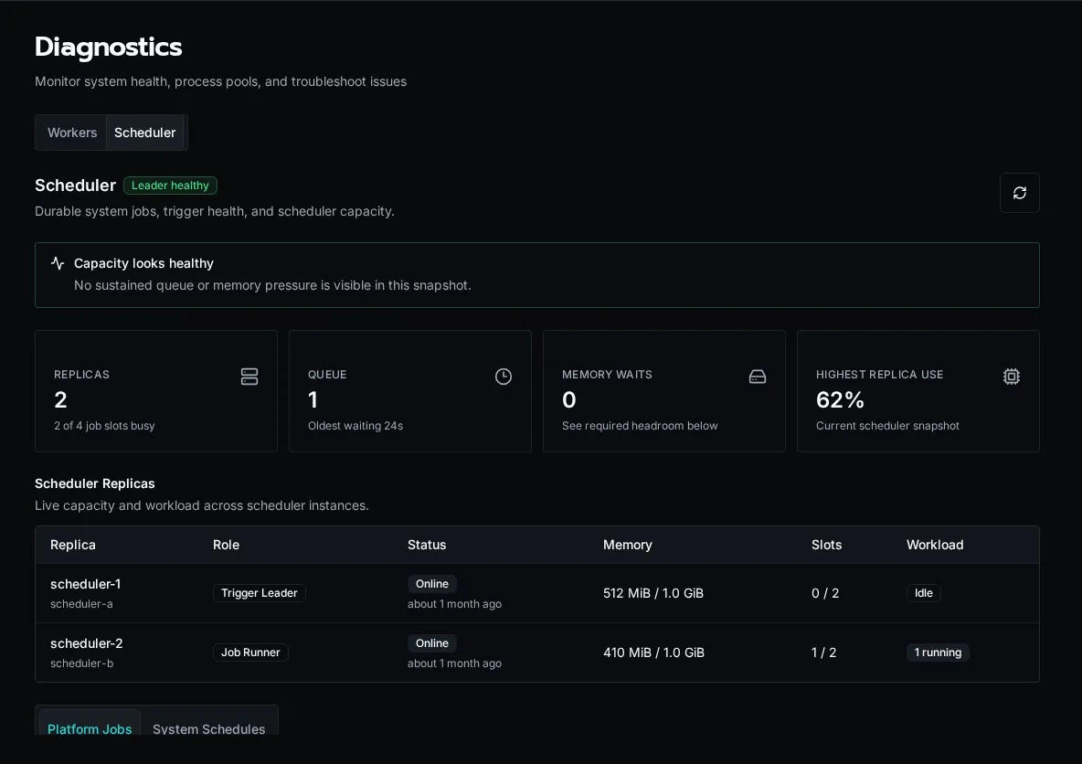
The replicas table shows which process owns the trigger lease and how work is distributed. The scheduled tasks table shows each task’s cadence, execution mode, next run, last result, and memory change. Select a task row to inspect recent runs and diagnostic logs.
Use the recommendations at the top of the tab as scaling signals:
- Add replicas when queued jobs persist and all slots are occupied.
- Add memory when jobs remain in Waiting for scheduler memory or utilization approaches the configured limit.
- Investigate the trigger leader when tasks stop advancing even though replicas are online.
Common ops scenarios
Section titled “Common ops scenarios”“Queue depth is climbing and won’t drain.”
Expand the container cards and look for forks stuck busy. If most forks are idle, your bottleneck isn’t workers — look at the API or RabbitMQ. If most are busy with the same workflow path, that workflow is the choke point.
“A pod just OOM-killed.” Pull the memory chart — you’ll see the climbing line right up to the kill. Cross-reference the fork that was busy at that timestamp with the Current execution column to identify the workflow. File a ticket against that workflow author with the execution ID.
“WebSocket says connecting forever.”
The browser tab is talking to the API; the API is talking to Redis to gather worker heartbeats. If the dot never goes green, check redis-cli ping from the API pod, then restart the pod.
What it doesn’t show
Section titled “What it doesn’t show”The diagnostics surface covers execution workers and the platform scheduler. It does not show:
- API request rates (use your reverse-proxy / APM)
- Database / RabbitMQ / S3 health (those are infrastructure dashboards)
- Per-workflow latency or token spend (use Usage Reports)
See also
Section titled “See also”- Audit Log — who did what
- Usage Reports — AI cost, CPU, peak memory
- Versions and Compatibility — pinning workers to a known-good build